


Porchlight is a Louie Awards Finalist!
Porchlight Press has been named a finalist in the 37th annual Louie Awards! We're extremely honoured to be included among some of the most talented publishers, designers, and artists in the...
Receive exclusive updates on workshops, new designs & all things letterpress.


Our Story
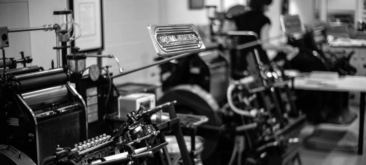
A place where the press hums with rhythm, where ink meets paper by hand, and where every impression carries weight, physical and emotional.
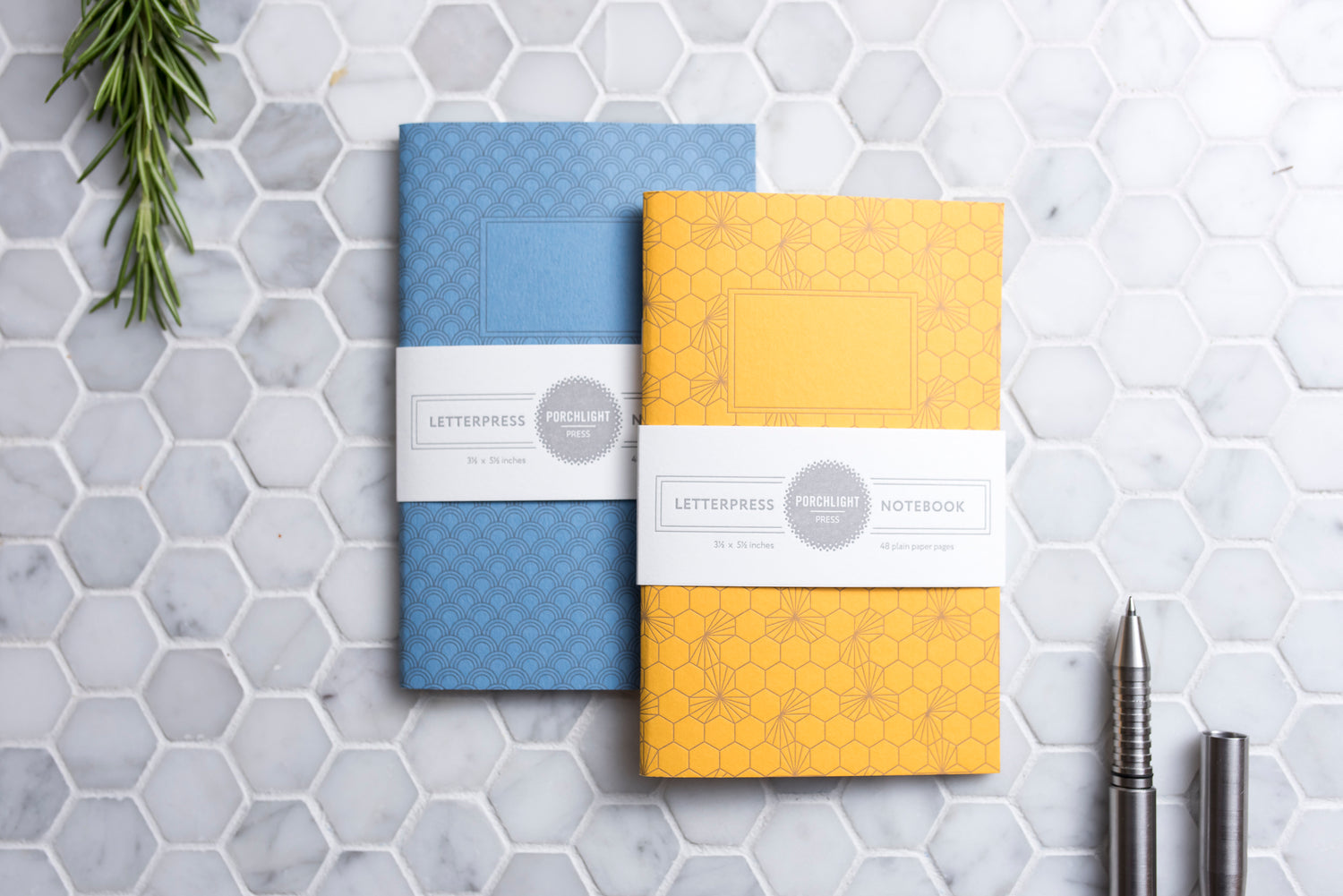
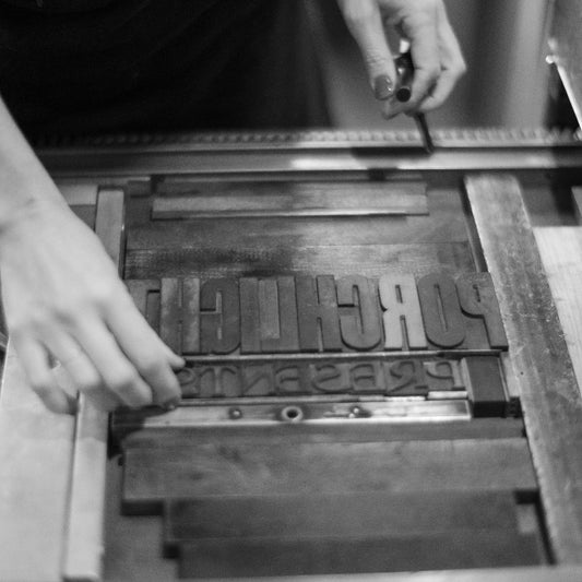
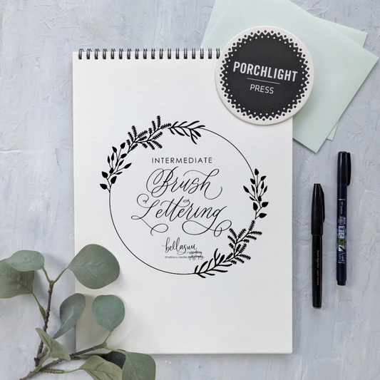
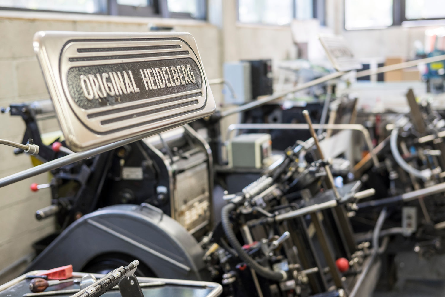
Letterpress is not just a technique: It's a language of texture, impression, and intention. Each piece is pressed by hand-fed machines, where ink is transferred with care, and every detail is considered.
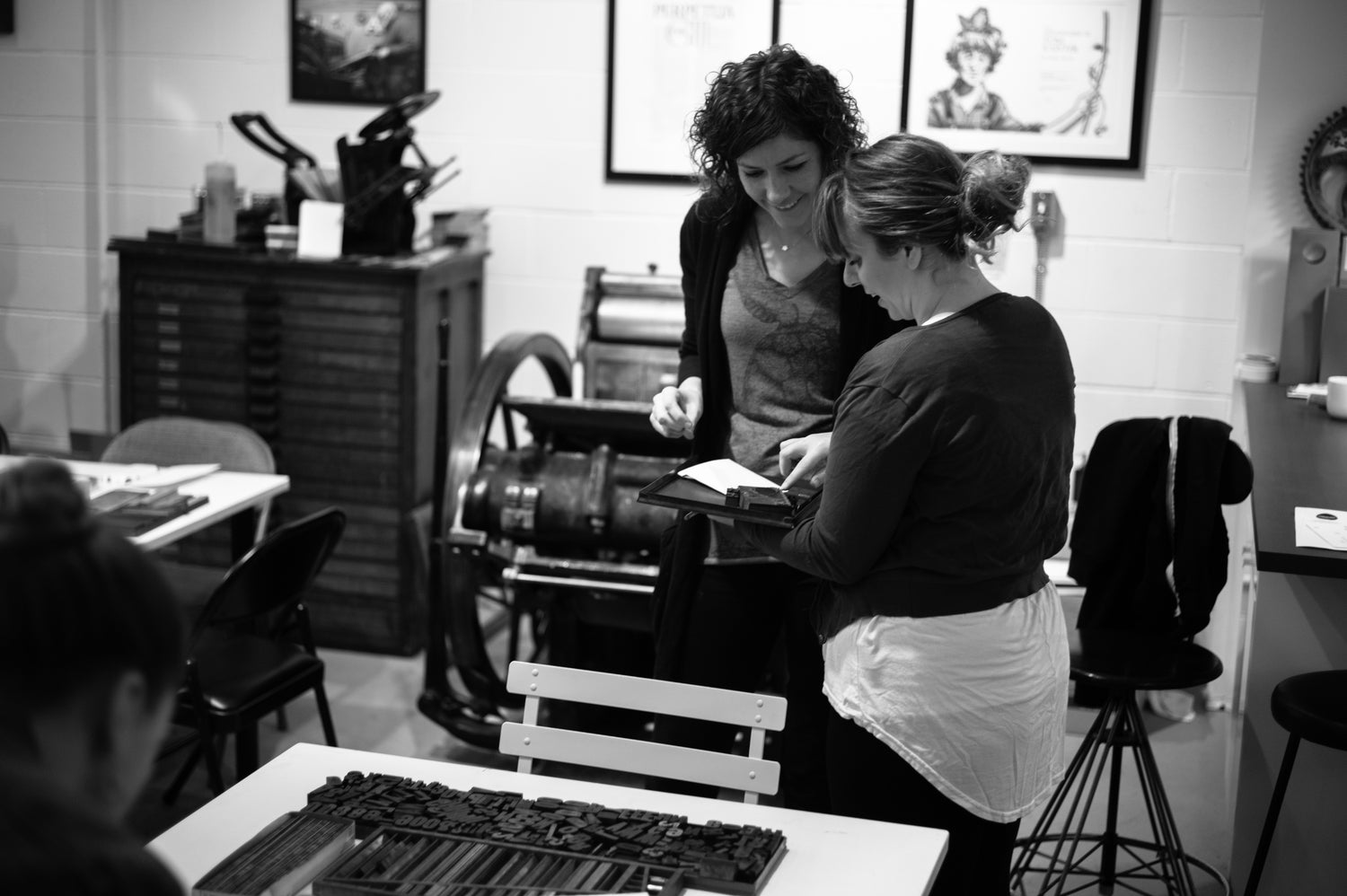
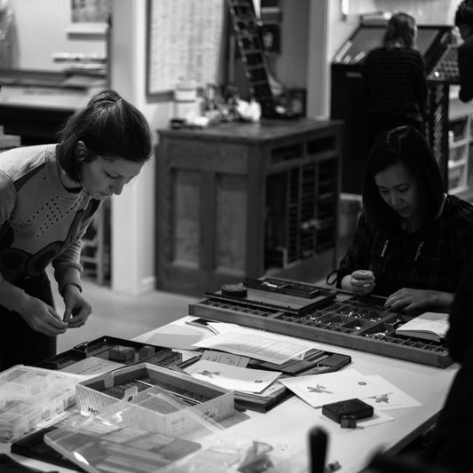
Porchlight is built on connection. We believe in reciprocity, between maker and client, process and outcome, giving and receiving. The work we create is shaped by collaboration, and strengthened by trust. That's why we offer space for community, big and small, to connect and thrive.
Porchlight Press has been named a finalist in the 37th annual Louie Awards! We're extremely honoured to be included among some of the most talented publishers, designers, and artists in the...

There is no denying we live in an increasingly digital world, which has seen new technologies render older processes and techniques obsolete, as markets hurry to meet the need for...

Our 2023 calendar is inspired by the over 1000 bird species that live in North America. Our avian pals are not only invaluable for our ecosystem, but they also inspire...